RIP Frank Kozik 1/9/62 – 5/6/23

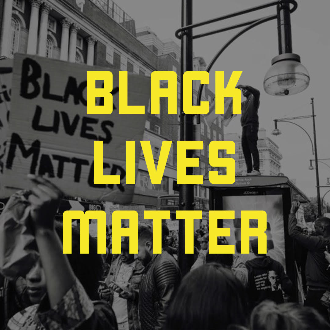
I saw the news on Facebook at some point over the weekend that Frank Kozik had died. Frank was one of the undisputed greats of the rock poster business, no doubt. Anyone you talked to in the Austin art world, and I presume well beyond, will attest to that. He was prolific, well-connected and had a strong style that was iconoclastic, ironic, satirical. His aesthetic was perfect for the post-punk and underground music scene that he so heavily influenced. In the early 90’s, Frank became known for his art prints and band posters, but we all have to make a living, and before he really took off, he took work where he could get it, illustrating whatever came up.

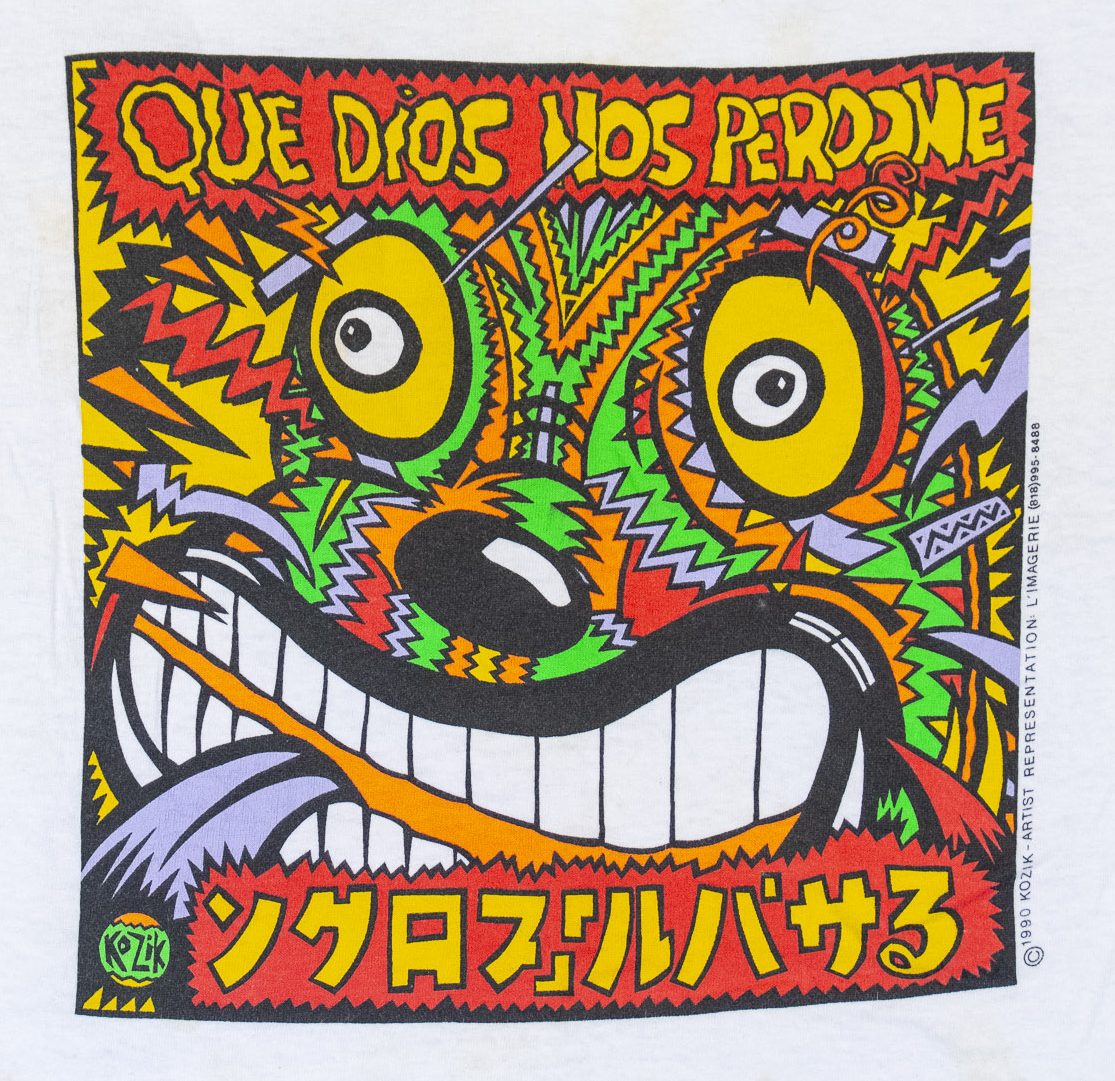
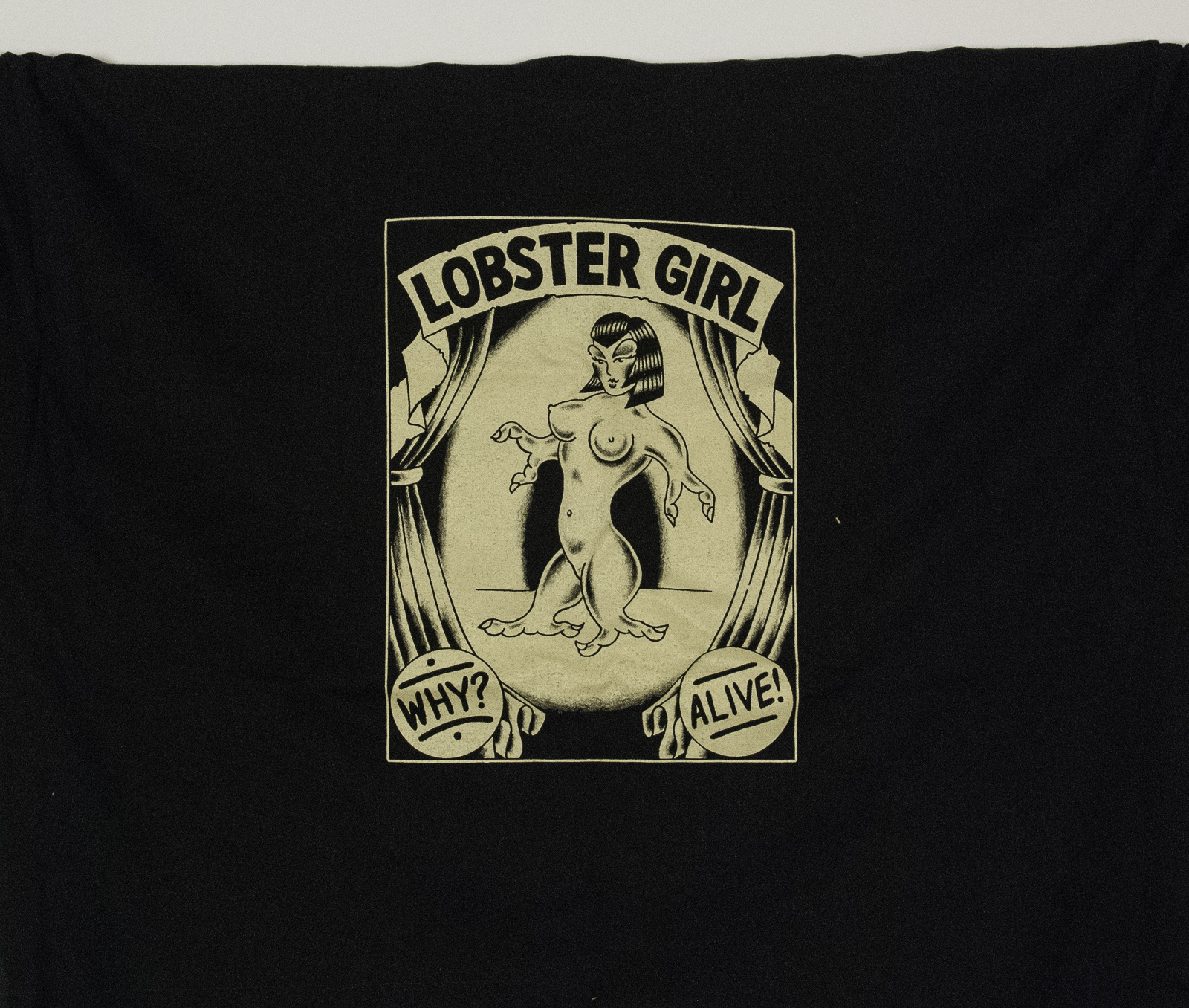
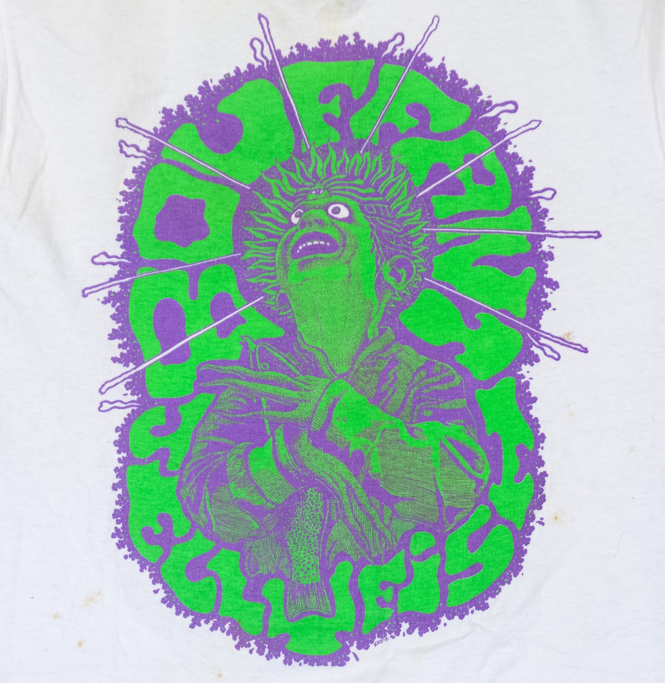
Some of that work was t-shirt designs, and I was fortunate to have printed several of those. I forget exactly how we got initially connected, but for a short while in probably early ’89 when he was in between gigs, Frank was actually an employee at the Action Screen Graphics, the shop I managed at the time. It was for just a couple months, but as the shirt design work rolled in after that, he brought it to us. At some point that year, he leased a space that was attached to the side of Action for his poster printing studio, so for a year or so, I saw him pretty much every day.

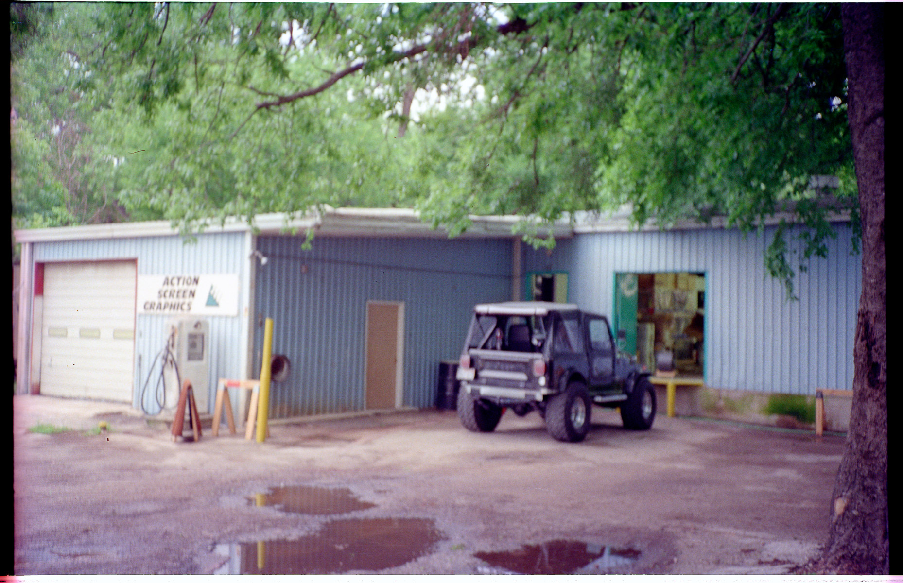
Frank’s studio was the left part of this building on Toomey Rd, with the overhead Door, and Action was behind it and to the right, through the open doors. Blurry pic is blurry. Not sorry, it’s all I have.


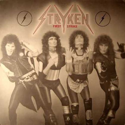
It seems trite when writing something memorial to say that someone was larger-than-life and had an outsized sense of humor that infected everyone around them, but this was true of Frank. His humor was dry and sarcastic, but he could laugh. I was at the pawn shop on S. Lamar one day retrieving a bass guitar (Hey, we were all still recovering from the 80’s and one did what one had to do) when I saw this vinyl LP for sale with the most hilariously bad cover art I’ve almost ever seen, and I snapped it up for a buck and gave it to Frank. He thought it was hilarious, and we had a good laugh. I half-expected bits of it to show up in a poster. My apologies if you were one of the members of Stryken, but man your cover was bad.

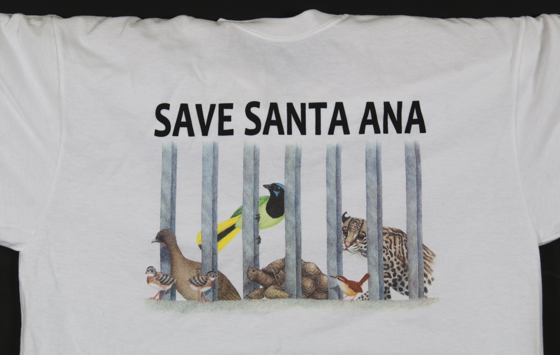
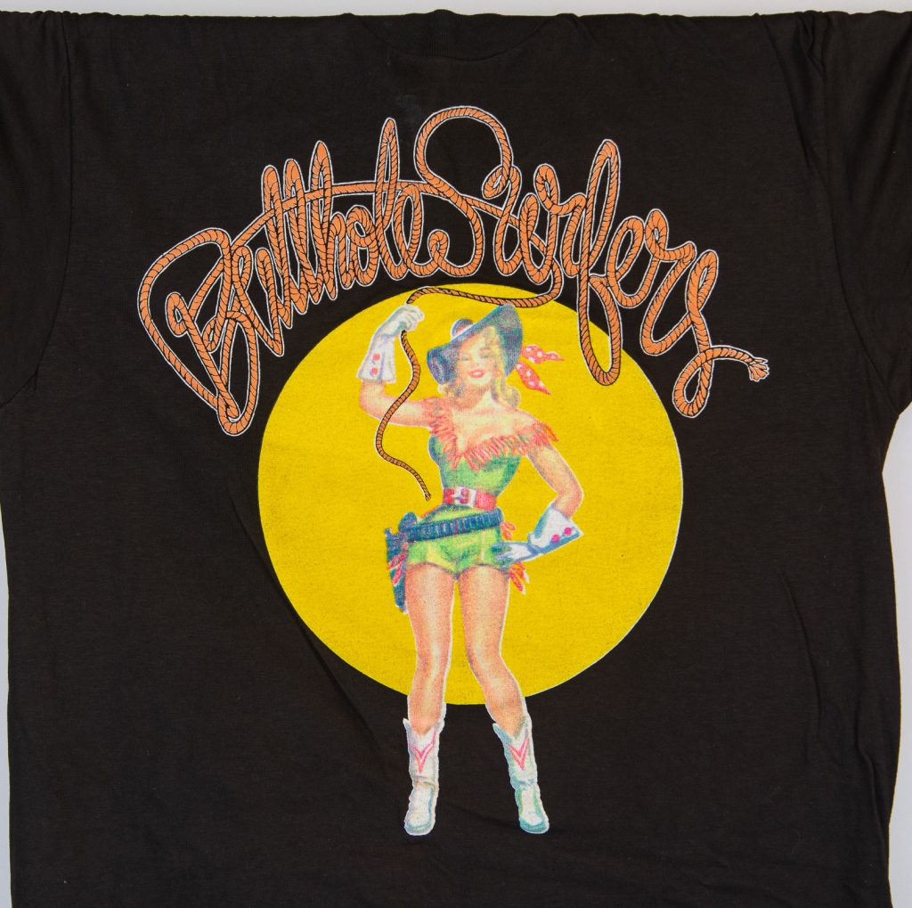
I’m not sure if Frank did this Surfers design or not, but I’m pretty certain that we were lucky enough to have printed some butthole Surfers shirts as a result of Frank being around. Gibby came by to press check this design, and I had the singular pleasure of observing him on one of the first cell phones I’d ever seen, cursing out a vendor in LA who refused to duplicate a film they needed to project at a show on grounds of Obscenity.

Actually, one of my early attempts at 4-color process on black. I wouldn’t deem it a great success. As with so much of my collection, I think I have this one because it was a reject.

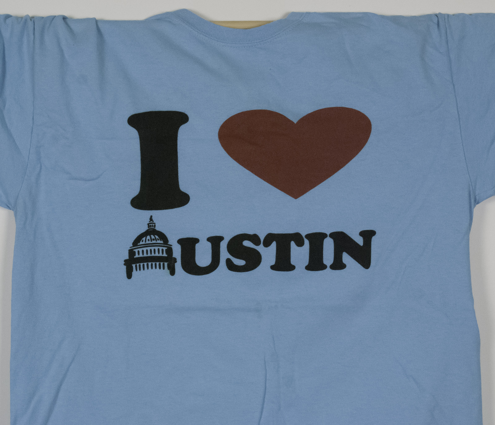
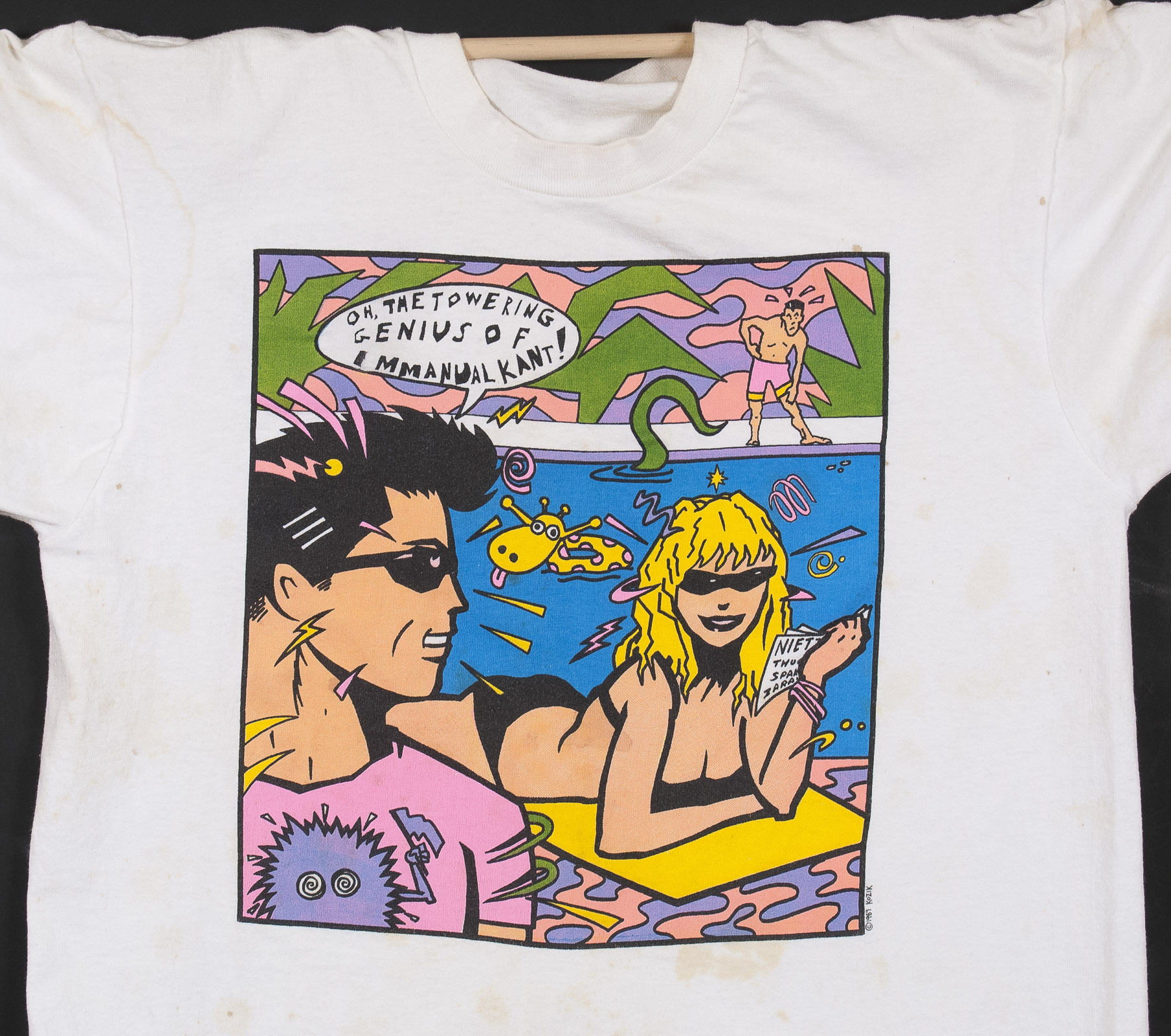
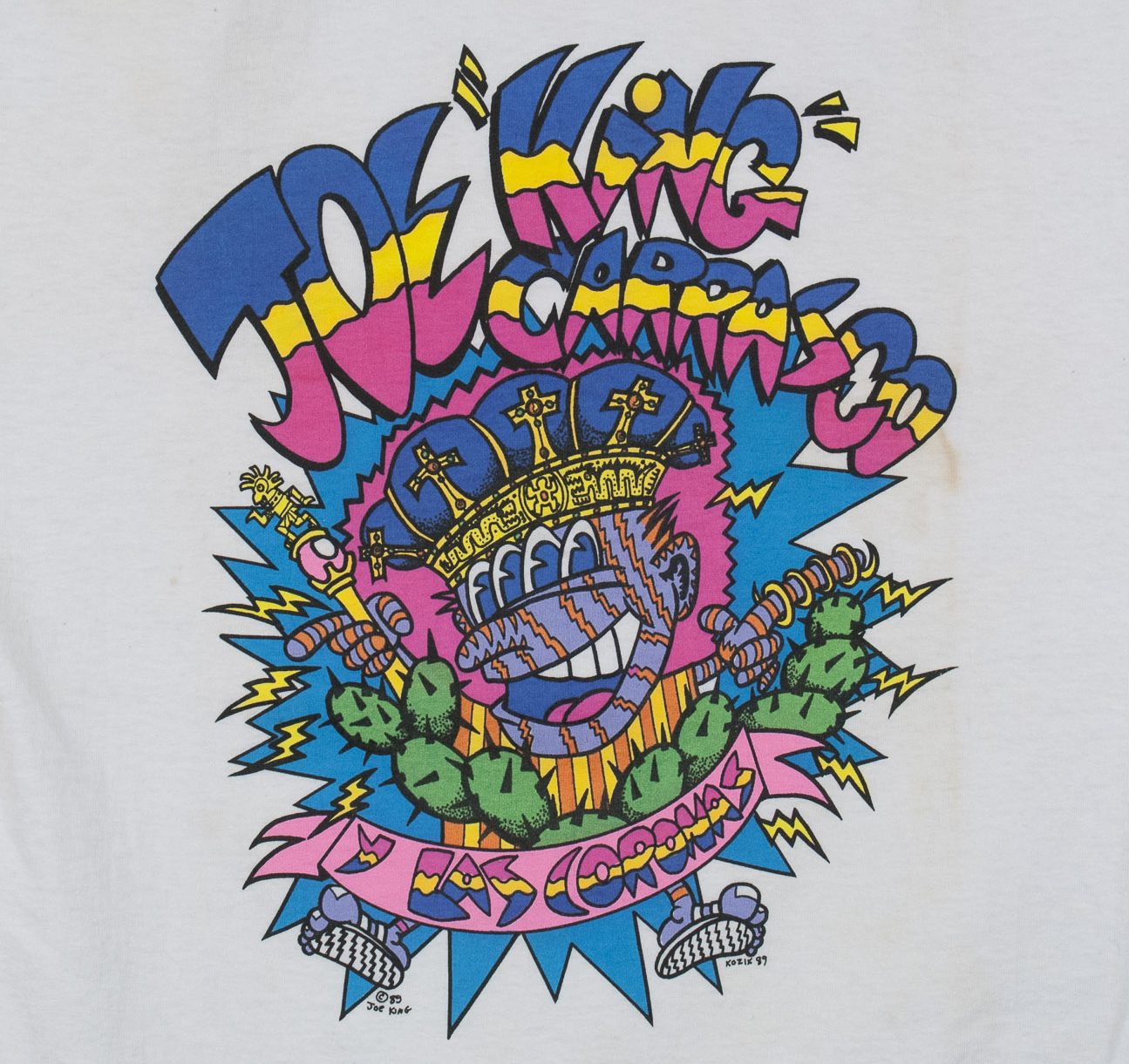
This is a shirt that he drew for, I think, a philosophy club at UT. It used to say something else in the word bubble, but I customized my own shirt by taping that out, and pasting in a line of dialog from one of my favorite cable access shows called From Socrates to Sartre with Thelma Z. Levine. Thelma was a huge Kant fan. In the process of doing that, I spelled Immanuel wrong, Frank noticed it and mocked me mercilessly. Deservedly so. I managed to kind-of fix it with a Zim gun, but alas. That was another aspect of Frank – if you were an idiot, he didn’t have any problem with telling you so. It was usually deserved. My friend Troy Dillinger wrote a pretty nice comment on Frank’s Facebook page to that effect on Monday. I’m not going to try to link it here because that never works, but if you know Troy, look it up.


So we all use computers now, right? I’m a desk jockey for the most part now. I’ve been running graphic design software since the late 90’s and it’s big part of my job to do stuff in Photoshop & Illustrator. Not so much so in 1990, but Frank had gotten his hands on someone’s Amiga, and was working on a Butthole Surfers album cover on it. We had a Windows PC at work with Win 3.1 on it, but it really didn’t interest me much and I never used it. He invited me over though to take a look at this thing, and he showed me some of the cool stuff the graphic design programs, even then, could do for image manipulation. He was really excited and enthusiastic about the potential, and it got me interested, too. Not too much later, I had my first Mac in 1994, and it was off to the races. So in a pretty large way, I have Frank to thank for giving me my first push into the digital age.

All the prints in this post were hand-separated, though. He would have a camera shot done to make a film positive of the line art, then cut amberlith seps with a swivel knife for all the colors. He was amazingly fast at it, too.


Some Youtube links of Kozik interviews:


Posted in Design and Art, History | 1 Comment

Black Lives Matter.

Greetings fellow citizens,
In response to the unrest in America
due the ongoing & unabating extra-judicial killings by police of our minority citizens, I insist you consider the following statement.

I may be just a t-shirt printer by trade, but through my many years of observation, and after some consideration, I hold that we as a society have got to start systemically rooting out the white supremacists from policing authorities nation-wide using a thorough review process with real teeth & we need to start that process ten years ago.

In union with that, simultaneously, we need to review & reform the process by which white supremacists are allowed or encouraged to be admitted to policing authorities as well as reforming the training process that emboldens these actors to commit these murders. This can be done, and needs to be done without delay.

We cannot expect the policing authorities to undertake these tasks of themselves, and I fully expect and encourage our elected officials who have oversight of any and all policing authorities to undertake this oversight process immediately and with much resolve.

In the 1960’s during a similar period of civil unrest, we had a fairly reform-minded justice department at the federal level (comparatively) that stepped in to monitor the most egregious breaches of civil rights & institute some small manner of reform. We obviously can’t count on that federal support today & reform needs to be instigated at the local and state level instead.

So I am calling on all councilpersons, mayors, aldermen, city managers, county judges, district attorneys, governors, state legislators & other elected officials with oversight capacity to start this work immediately. Platitudes and curfews will get you nowhere against this wave of anti-police sentiment we are seeing in our streets. Undertake the hard work to reform the systems you were elected to oversee.

Additionally, I am calling on all citizens to vocally & adamantly pressure their local officials to these ends, to pressure aspiring officials to make this issue central to their platforms, and to vote accordingly.

Resources & places to help:
Donate to Black Lives Matter and the NAACP Legal Defense Fund

Contact your local and state representatives. Feel free to use the text of my message if you find it useful.
And since this a t-shirt blog after all, get yourelves a Black Lives Matter T-shirt while you’re at it.

Posted in Uncategorized | Tagged , , , | Comments Off on Black Lives Matter.

I want one of these for my desk.

Short & sweet – a 3-volume edition depicting the entire RGB colorspace.

Posted in Uncategorized | Comments Off on I want one of these for my desk.

One 2 One

Bar on S. Lamar Blvd has been holding aritst’s markets specifically for working musicians who also create other forms of art, for them to vend their wares for a couple of years now. I finally got my act together & got involved, & I’ll be vending Wearable Serigraphy shirts at the Valentine’s Event this Sunday, Feb. 9th 2020 from 2-5 PM.

I’ve also had Precision Camera run me off some very nice 13 x 19 archival quality prints of 5 of my photos, if wall art is your thing.

All shirts are limited edition, signed & numbered, as are the photo prints.

Each shirt features new signed hangtags, designed by my awesome neighbors, Lewis Carnegie.

Posted in Design and Art | Tagged , | 1 Comment

Save Santa Ana!

Save Santa Ana T-shirtI’ve been too busy printing for the last several months to stop & blog about printing. But I am still doing some Wearable Serigraphy stuff on the side, and one of the groups of people I do a lot of work for is the birding community down in the Rio Grande Valley. Birders are critical about color & when you print a shirt with a bird on it, you really need to get it right. Anyway, the Rio Grande Birding Festival people got me in touch with the Santa Ana Wildlife Refuge last fall, as they are engaged in the fight of their lives, trying to keep the border wall from crossing through the middle of their preserve, and I’ve been printing shirts for them to sell at fundraisers & help support the cause. Here’s their Facebook page, also & the Save Santa Ana Facebook page.

I’m not super-educated with the details, but to hear Tony Bennet from the RGVBF tell it, the Feds want to put a portion of border wall straight though the middle of the preserve. As planned, it will apparently cut off the entrance & visitor’s center from most of the trails & the main viewing platform – not to mention the damage that bulldozing through a nature preserve would do. I had really hoped the border wall was just campaign trail bluster, but they’re pushing the thing through — lord knows what price we’ll pay in both tax dollars & ecological damage. Lord knows Mexico’s not paying for it.

Articles about the fight have appeared in the New York Times, USA Today, & the Texas Observer goes into some detail. The Sierra Club has also been active in the fight.

From my remove, printing a few hundred T-shirts seems like a paltry effort, but I sure hope it helps raise funds & awareness, & that this wall doesn’t go through the property as planned.

Posted in Uncategorized | Comments Off on Save Santa Ana!

Pigment Concentrates mix themselves.

We use Matsui’s 301 series waterbase inks, which is a pigment concentrate system, so rather than stirring blue & yellow ink together to get green, we add small amounts of very strong pigment to a clear base. In case you weren’t aware of it, you can get Pantone formulas for their RC & RC Neo systems in your browser. Use it every day.

Anyway. The other day, I was mixing some brown. I added the black & red first, but the yellow was heavier, & proceeded to sink beneath the other 2 pigments in the can. I had a “Whoa” moment & whipped out my phone & took this video of the cool swirly action of the pigments whirling around in the can. That’s pretty much the whole blog post, the end.


the shop is noisy, so I deleted the audio & added a bit of music from my band Carbon 7.

Posted in Uncategorized | 1 Comment

I’ve Been Thrift Store Browsing…

And I have “repatriated” some oldies & picked up a few new-to-me prints that I liked. The collection groweth. I wish I had kept one of everything, but that was literally impossible, so after 30 years, I find myself with a few hundred t-shirts, and some holes in the collection. Flipping through racks at Goodwill or ThrifTown is kinda relaxing and it’s yielded some fruit.

(Click through in-line images for full-size photos)

5by5. We printed this one at Amplifier is 2008 or so, I think. Found it unworn at the Goodwill. 5 color on a discharge uderbase. We did really good work there. Not sure who Merlin is — some tech guru?

5by5______________________________________________________________


Not the most exciting print, but ok, lets deal with the facts on the ground here — a man’s gotta eat. I love the art prints, I love the challenging discharge jobs, but sometimes, someone just needs their dang logo on a dang shirt, and they need it done right. These folks were customers for years and years, & they’d order 72 or 144 shirts every few months, and heck, they helped pay for my daughter to go to a good private Jr. High School. Thanks, Allied Health Careers.

Allied-Health-Careers-Back

Allied-Health-Careers______________________________________________________________


I bought this one new at the 2015 Armadillo Christmas Bazaar. They had last year’s-shirt on fire-sale, so I snagged a couple. It’s signed, but I can’t make out the artists’ name, &  I don’t know what shop printed it. It’s a great separation job, & reasonably well printed — 3 or 4 colors on a discharge underbase, though there are a couple minor flaws. Overall, a pretty impressive job.

Edit: A Facebook friend pointed out that this is the design work of Jay Long. Another mystery solved!

Armadillo-Christmas-Bazaar______________________________________________________________


This one came complete with the cat hair. No idea who printed it — it just seemed at the moment like I should own a Billy Joe Shaver shirt, and so now I do.

Billy-Joe-Shaver______________________________________________________________


This one is actually from Colombia. I looked at the tag & the shirt was Hecho En Colombia, so I figure it was probably printed there. Who doesn’t want a shirt from Colombia? Seriously.

Cafe-Colombia______________________________________________________________


I have no idea about this one, either. I just liked the print a lot. Very detailed, very crisp halftones, very cool artwork. A mystery. I googled Sine Quanon t-shirt & drew a blank on that logo.

Update: A friend noticed this winery website — apparently, this shirt is advertising for a variety of their wines.

Fitz-Poker-FaceFitz-Poker-Face-Sine-Quanon-Back______________________________________________________________


Frida! Marty at Be Bop used to print these for Tesoro’s Trading Co. We never printed the Frida shirt but we did a fair amount of work for Tesoro’s as well in the mid to late 90’s & one of their shirts ended up in Clueless. This print & shirt look new– unworn & unwashed, so it’s highly unlikely that it’s an oldie from the Bee Bop days, but whoever is printing it is almost certainly using the same film positives — I’ve seen them. They weren’t the best, but they weren’t the worst. There’s too much black in the clouds… anyway. Who doesn’t like Frida Kahlo? You? GET OUT.

Frida-Bee-Bop______________________________________________________________


I Heart Austin shirts were all the rage in the 80’s. This isn’t an original — it’s printed on a Gildan & those blanks weren’t around in those days, but it’s a waterbase print, & though sometimes I hate Austin, I still <3 Austin.I-Heart_Austin______________________________________________________________


Juke! Obama! Two Great Tastes That have great taste together! No idea why Juke did an Obama design, but I approve. When i see a Juke shirt, I buy it, and that’s pretty much that.

Juke-Obama______________________________________________________________

KGSR Hearts For The Arts Blood Drive. KGSR was a huge client the entire time VG was open & we printed shirts for nearly all their events for nearly 15 years. I could go on about how wonderful to work with they were & how we got perks like tickets to their anniversary shows at the Austin City Limits taping studio, etc. Everyone who worked there was kind, friendly & generous. Best Customer Ever award, 10 years running. I kept a lot of the anniversary shirts & the hot sauce festival shirts, but this one eluded me until last month. Of course we didn’t print everything for them, but look at the back — I’m pretty sure we printed this one.

KGSR-Blood-Drive-FrontKGSR-Blood-Drive-Back______________________________________________________________


Lobster Girl. Because I couldn’t NOT buy a shirt that said Lobster Girl. What sort of weirdo designed this? I don’t know, but now it’s mine.

Lobster-Girl

______________________________________________________________


Magnolia Cafe. I’m only halfway sure we printed this one. It could be of 3 different vintages — possibly printed at Action Screen Graphics, because I think we added the 2nd location to the typesetting there. Possibly printed at Bee Bop, and possibly printed at Vreeland in the early 90’s after Bee Bop shut down. Either way, I could walk to the ink mixing table and mix both of those colors with my eyes closed. Actually, that would be a bad idea, but I can’t find a good euphemism for familiarity here.

Magnolia______________________________________________________________


I just decided I should have an Obama Hope shirt because it was such an iconic design at the time. No idea where it was printed, but it’s new, unwashed & unworn. Pretty good for $1.99.

Obama-Hope______________________________________________________________


Panama. Does what it says on the tin. Shirt made & printed in Panama, & who doesn’t want a shirt printed in Panama? Seriously.

Panama______________________________________________________________


Longhorn Texas. This was from the very early days of Vreeland Graphics, before we had a computer — had to have ben late ’92 or early ’93. I recall this being a vry difficult print because the client had 4-color process separations made without consulting anyone, & we had to really play with the inks to get it to do anything. Also, this is a very washed & worn shirt — it was grungy enough that I was a little surprised a thrift store would accept it, but there it is. I’m not quite sure if it’s a bleached out natural cotton color, or if it’s a faded yellow white.

Process-Longhorn______________________________________________________________


Austin Reggae Festival 2011. No idea who designed it, no idea who printed it. It’s a well-executed print, though & also new– unwashed & unworn, so hey. I have a kind of soft spot since we did the father of the reggae fest, the Sunsplash shirts, waaay back in the 80’s.

Reggae-Fest-FrontReggae-Fest-Back______________________________________________________________


Robert Earl Keen, Wild Shiner Nights. We printed a LOT of Robert Earl Keen shirts at VG, including the iconic photo of his car burning in the parking lot of Willie’s 4th of July Picnic, & he always had challenging, fun designs. This one was 4 color process plus 2 spot colors — just about all our press could handle at the time. I kept one of nearly everything we did for him, except this one.

REK-Shiner______________________________________________________________


Rosedale Ride, 1999. This is a big charity event that we printed every year up though 2007. Richard Whittington & co. always did the design & we would do the printing at a discount in return for a small “printed by” tagline which you can barely make out at the lower right.

Rosedale-Ride-1999


Rosedale Ride 2000, See above.

Rosedale-Ride-2000______________________________________________________________

Tito’s Vodka started off with a very small run of shirts in the mid-2000’s. Then they kind of blew up. I’m not absolutely certain that we printed this one, at Vreeland but odds are good. I know their orders now are in the multiple thousands, wherever they’ve ended up.

Titos-FrontTitos-Back

Maybe I’ll run by the St. Vincent De Paul tomorrow.

Posted in Design and Art, History | 1 Comment

New Wearable Serigraphy Prints for sale!

At long last, I have finally put the finishing touches on my latest set of art prints. Each of these shirts is from a 35mm photograph of mine.

Maple_1200Maple Leaves is a photo I took in Zion National Park the summer after I got out of high school. I borrowed a camera from a family friend who was along for the trip just long enough to shoot one roll, and somehow the negatives miraculously survived at least 20 moves before I re-discovered them in a box just 3 years ago. I think it was the third or fourth roll of film I ever shot in my life.

Sleping_Lion_1200Sleeping Lion Mountain was taken early on Thanksgiving morning, 1998 on my amazingly trusty Zeiss Ikon Contina. This was a consumer-level point & shoot in the 1950’s & it only has a view finder, so you have to judge the distance & set the focus ring by guesswork. Or infinity, which usually works. Absolutely a great camera outdoors & I think it has a wider tonal range than my Nikon D80 digital. Louise was pregnant with Jacob and suffering terrible morning sickness, so I snuck out of our hotel room on our first trip to Fort Davis & went for a very early morning walk while she slept. These rocks are just behind the church at the north end of Front Street.

Century_Plant_1200The Century Plant in Big Bend was taken with the same camera on New Years Day 2012, on our second trip to West Texas when we were taking Jacob to his first star party at McDonald observatory. We only had one day in the park, & I felt very fortunate to come away with this shot.

All the negatives were scanned with my Nikon Coolscan V set to color instead of black & white, & that’s what imparts the cast to these images. I tried to keep these tones faithful as I rendered them as quadtones in Photoshop. The film was all run out at 85 line by the ever-capable Kathy Hill at Graphic Arts inc. & screen printed by me. Each shirt is a 5 or 6 color — tritone or quadtone plus white highlight & text. Individually numbered, each edition will be limited to 144 prints.

Available for purchase here!

There are Higher-res versions of these photos, plus some detail shots on my Flickr page.

Posted in Design and Art | Comments Off on New Wearable Serigraphy Prints for sale!

Weird Yet Strange

My Friend Danny GarrettWeird_Yet_Strange_Cover_1600 has written a book, Weird Yet Strange, (published by TCU press, also available locally at Book People or on their website) about his years as an Austin music poster artist in the 1970’s & 80’s. It’s not a complete chronicle of his career as a commercial artist, painter & teacher, but it is a very thorough & engaging history of a particular art movement in Austin & his place in that scene, among the giants of Austin music art like Guy Juke, Jim Franklin, Micael Priest, Kerry Awn & others.

The book of course starts out recounting his time as a freelance poster artist for the Armadillo World Headquarters, then moves semi-chronologically through his years doing many fine pieces for Antone’s, the world-renowned blues club, his work for Willie Nelson, & a chapter on Stevie Ray Vaughan, who in any book about Austin music certainly deserves his own chapter.

I first met Danny in 1984, shortly I began printing. One of the first shirts I ever printed was his Antone’s Little Walter design. Because of the amazing detail in Danny’s design, I had to get good quick in order to do it justice so I credit his as giving me an early push to improve my craft as a printer. I have held the original in my hands, and do not feel worthy.

There’s so much good Garrett art that it’s impossible for one book to do it justice – he rarely sells his original paintings, though they do appear in his posters from time to time. I enjoyed his recollections of the history behind Austin’s music art scene, but would love to see a proper coffee table book concentrating on the art itself & spanning all aspects of his career. I hope that’s next.

Garrett_SpreadThe only downside to Weird Yet Strange is that Danny has so much to say that there’s not enough room for images, and a lot of really amazing art got relegated to relatively small reproductions. Thing is though, Danny’s also a teacher & he has a head full of information & amazing ideas, so it really is awesome to see some of that down on paper where it belongs.

We went to his book signing event at Book People & he gave a really nice talk for a good 30 minutes before opening it up to questions, which went on for another 20 minutes, or so. There were plenty of alumni in attendence — Franklin was there as was Kerry Awn, & I recognized Tommy Bauman by the sound of his voice before I “recognized” him — it had been that long. It was a nice reunion of sorts, though I mostly observed from the back. Of course, I wore an Antone’s shirt for the photo op, as one does.

———————————————————————————————————

A final note; one of thanks. It was only upon reading the book that I noticed he included me in his Flatstock poster in tribute to the printers, some 10 or so years ago. I’ve seen the poster but my name eluded me until now. I managd to acquire one this year at the Armadillo Christmas Bazaar, thanks to the folks running the South Austin Popular Culture Center booth – my ego doth swelleth accordingly. Thanks, Danny! Also, thanks for the book — it’s a jewel.

———————————————————————————————————

A final final note: Amongst the shirts I have been cataloging recently, I found this unsigned Joe King Carrasco shirt which Danny has admitted to drawing, on Facebook. It was a 4-color process print, with all the seps drawn by hand. I recall other than the black line art, each sep was a combination of amberlith & rapidograph drawn directly onto the acetate. Not much margin for error there. I think it’s a gorgeous design today.

Garrett_Joe_King_Shirt

Posted in Design and Art, History, Profiles | Comments Off on Weird Yet Strange

Jumbled Numbers

Brick Wall


The Pantone corporation has owned the color-matching business for as long as I have been printing, and us screen printers have used their standard coated & uncoated fan books to match spot colors since the dawn of the mists of time. A designer in Philadelphia can call on the phone & say “print it with green 368c,” & we know exactly what they’re talking about, because he & I both have fan books.

For umpteen of those years, the colors in the books were arranged sequentially from the lowest number to the highest number, so finding a color in the fan book was a matter of seeking out the number, in sequence. A fairly simple matter. 3 or 4 years ago though, Pantone decided that with all the new additional colors being sequestered at the back of the book, it was becoming unwieldy for designers to pick colors by color family, so they re-arranged the books so that all the newer colors (they add 10 or 20 a year) were mixed in with their color families, and the fan books since them have not been arranged numerically. At first I thought “huh, the paper on this new book seems thinner,” and I hardly paid any attention to the rearrangement of the colors in the book. Until I needed to find one. Where the hell was it? The printers were waiting for me to approve a print, & jobs were stacking up while I dug & dug through the book.

Fortunately, there is an index now added at the back of the book with a list of numbers, & a corresponding page number, but man, it’s cumbersome. Let’s see.. Blue 2727, page 142, flip, flip, wait what page? dang it… wait, what number? With 6 or 7 spot colors to proof on a t-shirt job, I had numbers bouncing around inside my eyeballs, while printers & jobs waited & waited… page 346… no wait pantone 346… page 220… no wait PANTONE 220… page 346… ugh.

I have been heard to vocally express my dismay on the pressroom floor, and I noticed how much it was bugging the hell out of my printers, too. They have a work order with 6 colors listed on it and need to find the cans or mix the colors, and the same thing — it was taking them time to dig through the index, then dig through the book, & by the 4th color, everyone’s eyes glaze over, & you forget what you’re doing. Time wastes away, and nothing gets printed.

It occurred to me that the simple, obvious solution would be for Pantone to issue two editions of the fan book — one with the colors grouped in families for designers, and one grouped numerically for printers. An idea! A solution! Pantone Coated, Printer’s Edition! I would pay extra money for this, at this point. Back in September, I floated it via email to the support address at Pantone, more or less not even expecting a reply. It read thusly:

Hi folks,

I may be one small voice in the wilderness, but I feel like I need to speak, regardless. I am a printer — I work in print production.

The old Pantone fan books, for many years, had the color chips numbered sequentially in the book. For reasons that seem logical to you — i.e. easier for designers to search for color families — you re-ordered the book to where the numbers are totally out of sequence, and we are directed to an index at the back of the book that tells us what page to find a particular swatch on.

I can’t even begin to explain how greatly every production person I’ve spoken with reviles this decision. It is a huge waste of time on our parts rifling through the index, then rifling through the pages trying to find the swatch we want to match. The excoriations towards the new books by everyone I’ve spoken to about them are basically unprintable, so I won’t repeat them here. Know that they are universally detested by anyone working in production that I have spoken with since their introduction — hundreds of people.

My solution: Please, for the love of all that is good & right in this world, issue a “printer’s edition” of your fan books, restored to their former ordering, with the swatches in numerical sequence. I would buy two of them the day they were released, just out of gratitude.

Thank you for your consideration,

A very frustrated consumer,
Chris Vreeland

Sure, some of that was me just venting. Believe it or not, just a day later, I got an actual response! They were listening. Well, no, actually they weren’t.

Dear Christophe:

Thank you for your comments concerning the PANTONE PLUS SERIES publications.  We appreciate your writing with your concerns.

The chromatic reordering of the PANTONE colors was done in response to continuous user feedback requesting a more logical arrangement of the PANTONE colors.  As the PANTONE MATCHING SYSTEM color palette has been expanded over the years, the chromatic order has suffered greatly.  As a result, we essentially ended up with reds, greens, blues, etc., in various different sections of the guides, making color selection and specification more complex and confusing for those who choose PANTONE colors for their projects.

By ordering the colors chromatically as we have done, we have made the selection process much more straightforward, and in fact we have had mostly positive reactions from those on the selection/specification end of the process.  This was the only way that we could maintain the existing PANTONE colors with the descriptions that users have known and used for over 45 years.  The alternative would have been to change the numbering system, and it was felt that this would be a nightmare for long-term users of the products.

We understand that those in the printing industry who have grown accustomed to working with the previous PANTONE products are frustrated with this change, and that initially it will cause some confusion.   However, as with any change, it is our feeling that over time, users will see the benefits of the new PANTONE PLUS SERIES products, and this will become less of an issue.

Please do not hesitate to write us at any time if we can be of further assistance.

Best regards,
Pantone, LLC
Wholly-owned subsidiary of X-Rite, Inc.

Basically, Not. Gonna. Happen. Thus endeth this wasted missive.

Posted in Design and Art | 2 Comments